Albrecht Dürer’s Material Renaissance
Authors: Phoebe Clarke and Sally Foster
Editor: Noni Zachri
All texts copyright the authors. Use without prior permission is not permitted. For queries, please contact Grimwade Conservation Services.
Is there more to learn from the work of Lucas van Leyden? The examination of engraving inks using XRF Spectroscopy.
The Prints and Drawings collection at The University of Melbourne houses a significant collection of rare prints by renowned European masters such as Albrecht Dürer, Rembrandt, and William Hogarth, as well as works by lesser-known artists. With nearly 9,000 prints dating back to the 15th century, this collection is a vital resource for teaching, research and exhibitions, guiding the specialised preservation approach undertaken by curators, conservators, and students.
One notable artist in the collection is Lucas van Leyden, a 16th century Dutch printmaker renowned for his humanist portrayals of traditional Christian narratives and his light-handed and subtle engraving technique. Lucas, a contemporary of Albrecht Dürer, had a substantial influence on subsequent artists like Rembrandt and Pieter Bruegel the Elder. His prints, known for their characteristic grey or silvery tones, contrast with the richer, more pigmented prints of Dürer, often attributed to differences in their engraving techniques and ink choices. Lucas’s work is historically significant in Netherlandish art, and a recent research project sought to deepen the understanding of his technique through scientific analysis.
As part of the University’s Master program in Cultural Materials Conservation, students can undertake internships involving conservation treatment of items in the collection at Grimwade Conservation Services. During one such internship, an opportunity was provided to analyse six of van Leyden’s engravings using X-Ray Fluorescence Spectroscopy (XRF). The goal of the analysis was to gain a better understanding of the elemental composition of the inks used in Lucas’s prints, offering potential insights into his techniques and artistic choices.
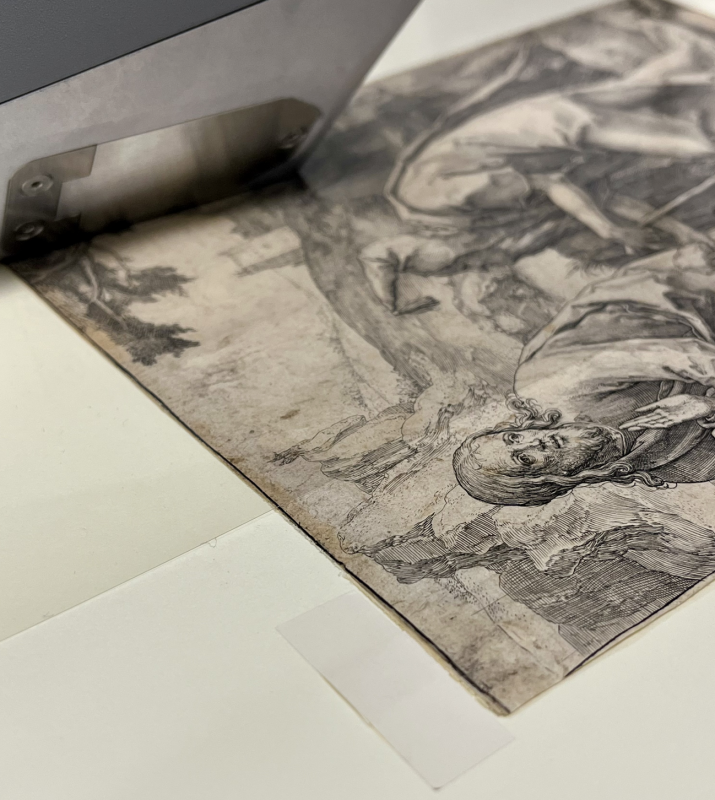
XRF is a non-destructive technique used to identify the elemental composition of materials. When an object is exposed to X-rays, the energy causes the atoms in the material to emit fluorescent photons. The unique energy signatures of these photons can be detected and analysed to determine the elements present. This process was used to examine the ink and non-ink areas of the engravings to identify elements in the prints and offer clues about the materials Lucas may have used.
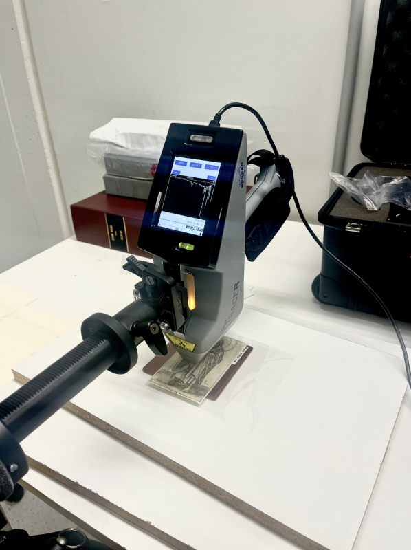
One of the key observations from the analysis was that van Leyden’s prints were predominantly characterized by a homogeneous elemental profile, with a consistent presence of calcium and iron across most of the samples. The analysis revealed some trace elements such as copper and nickel, which may indicate the use of copper plates for printing. A significant difference in the calcium levels between inked and non-inked areas in one print suggested the possibility of prior treatment, which could have introduced more calcium into the paper.
Interestingly, the XRF analysis also revealed an unusual presence of titanium in inked areas of one print, which was surprising given that titanium is a modern pigment. This unexpected finding warrants further investigation to determine its source and whether it relates to more recent treatments, or mounting materials, is an indication of a later 19th century printing from the plate (not uncommon when plates were bought and traded by publishers after an artist’s death), or simply an error in analysis Traditionally, intaglio inks are derived from organic carbon-based pigments, and spectra with limited variation supports this observation. While carbon does not have sufficient molecular weight to be measured by XRF, its presence can be confirmed through other techniques.
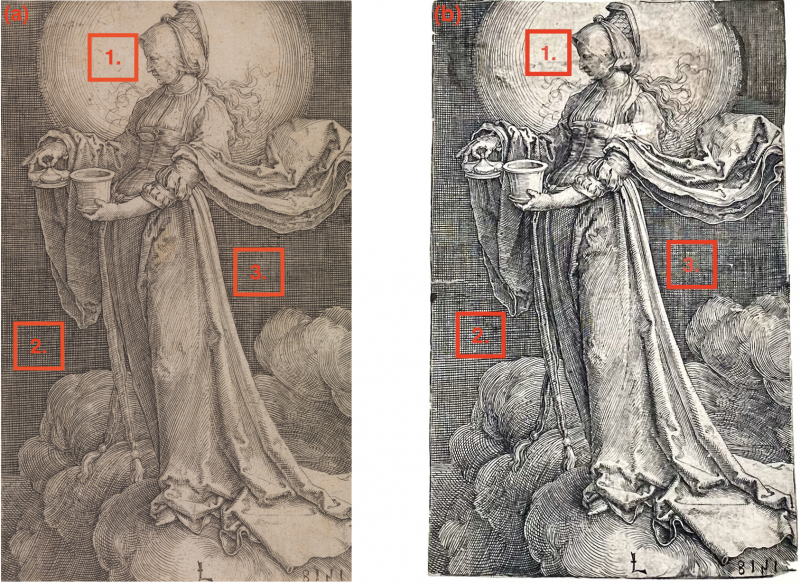
In comparison with other 16th century engravers, such as Hendrick Goltzius [i], XRF results from Lucas’s prints suggest that his inks were likely carbon-based, with smoother characteristics and a more consistent appearance. This aligns with the generally accepted understanding that van Leyden used black intaglio ink, with the lighter tonal qualities of his prints resulting from his engraving technique rather than the composition of the ink itself.
The findings from the XRF analysis support the idea that Lucas’s unique tonal effects are due to his artistic technique, particularly the skillful way he used of the burin to lightly engrave shallow lines on his copper plates, which effected how the ink sat on the plate and was transferred to the paper. However, the elemental analysis also raises intriguing questions about the specific composition of his inks and whether they varied from traditional formulations. Comparing Lucas’s prints with works by Dürer, using similar analytical techniques, could provide further insights into the differences in their materials and methods.
This project highlights the value of scientific techniques, such as XRF analysis, in deepening our understanding of historical art practices. By examining the technical makeup of Lucas’s prints, we gain new perspectives on his technical mastery and can develop more informed conservation strategies for preserving these important works. This analysis also provides important curatorial, cataloguing and provenance information for the prints held in the University of Melbourne Collection. Future projects, incorporating additional analytical methods like Raman spectroscopy, could provide further insights into the organic components of the inks and Lucas van Leyden’s practice. Ultimately, such research enriches our knowledge of art history and offers a deeper appreciation of the materials that contribute to the creation of these enduring masterpieces.
____
[i] In a comparative study of prints, Kimberly Schenck analyzed engravings by Hendrick Goltzius alongside works by Dürer and Van Leyden from the Baltimore Museum of Art’s collection. Goltzius, active in the 16th century, was known to have passed off his prints as those of Dürer and Van Leyden. Schenck’s analysis of Goltzius's inks revealed that he created the grey tones in his prints by adding coarsely ground lead oxide to black ink, likely prepared separately. This addition can be detected under a microscope. In contrast, the inks used by Lucas van Leyden have a smoother appearance, with lines showing the typical reticulation of intaglio prints. These characteristics are consistent with the age of the works, and the ink appears to be embedded within the paper substrate.
Albrecht Dürer’s Material Renaissance
The exhibition, Albrecht Dürer’s Material Renaissance provides an in-depth encounter with German artist Albrecht Dürer (1471-1528) and the material culture of his home city of Nuremberg. It explores how print and book production developed in Nuremberg from the late 15th century alongside constant innovation in the city’s craft and manufacturing trades. The exhibition is co-curated by University of Melbourne staff Hansen Associate Professor Jenny Spinks, Dr Matthew Champion, Professor Charles Zika, and Dr Shannon Gilmore-Kuziow; they have worked closely with colleagues in the University’s Special Collections, Grimwade Conservation Services, and State Library Victoria. Research towards the exhibition was funded by the Australian Research Council Discovery Project ‘Albrecht Dürer’s Material World – in Melbourne, Manchester and Nuremberg’ (DP210101623).
It will be open in the Arts West Gallery from 22 July to 29 November 2024, Monday to Friday. Admission to the exhibition is free.

Interested in learning more?
For further information about materials analysis and conservation contact the team at Grimwade Conservation Services.
Featured content
-
About the exhibition
Find out more about Albrecht Dürer’s Material Renaissance
-
Research
Discover the research behind the exhibition
-
Exhibition conservation
Find out more about the role of conservation in the delivery of this exhibition.
-
Student experiences
Find our how students assisted in the delivery of Albrecht Dürer’s Material Renaissance